I am looking through the Feb 20 Publisher's Weekly which includes the very long list of Children's Books for Spring. This breaks down books from tons of publishers, gives a little blurb, and the ISBN number. While going through this list I've released that there are just some things in the publishing industry that make me ask, wtf??

1. Severely outdated covers on BRAND NEW books. Yes, I am looking at you
The Not Quite Perfect Boyfriend. Although you are not the only one that is guilty of this, but honestly, admit to yourself...you are stuck in the late 80's. I would never buy this book to put in my Teen collection. NEVER. My teens would laugh at this book, and think my obsession with the 80's has gone way too far.
2. Books with generic names.
Dead Reckoning is the name of a book due out this summer from Mercedes Lackey. It is also the name of about a dozen other books by various authors. No, not every book can be
The Hunger Games, or
Shattering Glass, or any book with a catchy name, and honestly some unusual names are just too weird. But some of these names are so generic, and so lame, that I just get confused and then don't care one way or another about the book.
3. Angels, nuff said.
4. Books where the cover picture looks like it was taken with a cell phone in a room with only one tiny light bulb lighting the way. Now I love dark images, and shadowy-ness, and brown. But, some covers are just too murky and dark for me.
In Too Deep is one of those covers. I almost, ALMOST, love it, but there is just to much darkness going on, and it makes everything seem blob-like. Plus, it does look a bit dated. Now, in person, this cover might look awesome. But, my monitor isn't that amazing, so I can't tell if it would still look flat, blobby, and murky in person or not.

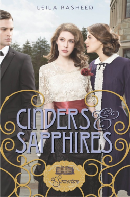
5. Using the same stock pictures on multiple book covers and not giving a rat's ass that it is obviously the same.damn.picture! Oh look, someone decided that the same picture of John Winchester was so awesome that it needed to be used twice! I mean it isn't obvious or anything. Taking off the raven, and putting in a blue background totally changed the entire picture....yeah not so much.
There are more things that drive me nuts. Like teen books where the cover model looks older than Nancy Drew of either of the Wakefield twins ever looked. Books where the cover model looks constipated, or where it looks like the cover is just made up of random clip art.
Lord help me, I am only to the N publishers in this magazine. Who knows what I might come across in the second half of the alphabet.


